
macOS 26 Beta
I got in on iPadOS 26 at Beta 3 and macOS 26 at Beta 4. The public beta is due sometime in July with full release by the fall, likely August or September, since they already removed a lot of debugging APIs from earlier builds.
On first glance, it’s evident that the two divergent operating systems have finally merged. I even said this on MacRumors when the news first hit with mixed to positive reactions. The foundation was certainly laid early, though, what with the M1 and Mac Catalyst, it was telegraphed as far back as 10.7 Snow Leopard when App Store hit macOS for the first time.
The Apps
I’m glad they finally ditched the Launchpad from Lion in favour of the App Library. If there is any good reason to hop on early, it is for that. Launchpad was such a pain to work with. The new library basically merges that and Spotlight. It kinda functions more like OS 9’s Sherlock but for applications.
The Journal app is finally on both iPad and macOS as well! I have no idea what they were thinking by making it iPhone first. Seriously, not everyone can type a wall of text on a smartphone like the TACO in the White House.
Aside from the Clock I use sometimes on my tablet but I rarely use my iPhone for calls, I don’t really have much to say. xD `Most of this release’s focus is on the new redesign.
Liquid Glass
Now for the piece de resistance.
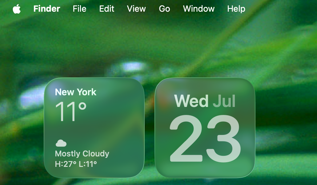
Liquid Glass is interesting on macOS. What do I think so far? It’s rounder, to say the least. Not entirely sure how I feel about translucent or tinted icons. Apple’s idea of dark mode is 50/50. Not good, not bad. Gets the job the done.
Using Music as an example, the toolbar controls are now on the bottom and the system feels like it is hovering in mid air. As long as you don’t mouse over it, you can click whatever you want. While it’s cool, I have this urge to grip it and move the toolbar around like it was the old iTunes MiniPlayer.
Following in mobile design trends, hamburger menu ensures that sidebars are truly kept to the side and put the content front and centre. For macOS, this isn’t that bad because menu bar is in an easily accessible place (unlike Windows).
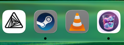
An interesting decision was that applications whose icons never jumped on the iOS-style design bandwagon are automatically put in that clickable bubble, regardless. I’m assuming this is for consistency sake’s and to make tinting easier. It doesn’t look all that bad, some fair better than others, as you can see.
Overall, first impressions is that the design certainly fairs better on macOS (and even iPadOS) than iOS this time around. As you can imagine, this is going to lead to yet another split base.